Case Study #1: San Antonio Shitokai

Original Ads
Prototype
Final Ad
Original Prototype Final
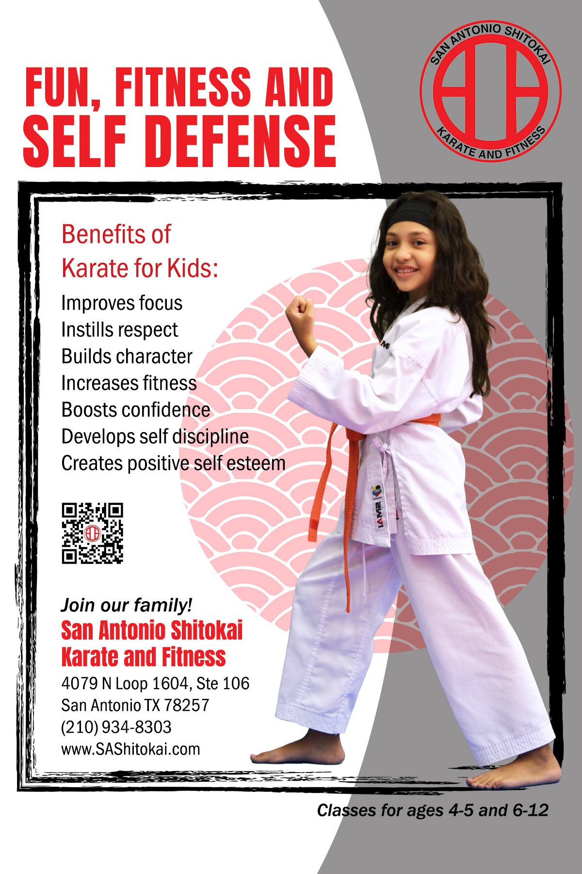
The client asked me to redo five of their ads for distribution as 6"x4” postcard-style ad. The original ads were grayscale. Titles and subtitles were too similar in size and competed for attention. The all-caps lists of benefits tended to “shout” at the reader and was visually busy. In the Children's Class ad, a child was sitting on the sidelines and was not engaged with the class (which was also facing away). The client requested a new design, featuring black, white, and red (the latter to match their logo) colors, as well as actual student photos.
I photographed several students and then created the prototype. I chose a child in a dynamic pose, facing the audience, with a foot breaking the frame. My design pays homage to the Japanese roots of this style of karate while being clean and modern. The brush-stroke frame imitates calligraphy seen in traditional Japanese art. The red circle symbolizes the rising sun Japanese flag, while the pattern inside mimics Japanese wave paintings. I created more hierarchy between the title and subtitle and used text with different sizes in two sans serif fonts which convey strength in caps, and a quiet calm in lowercase.
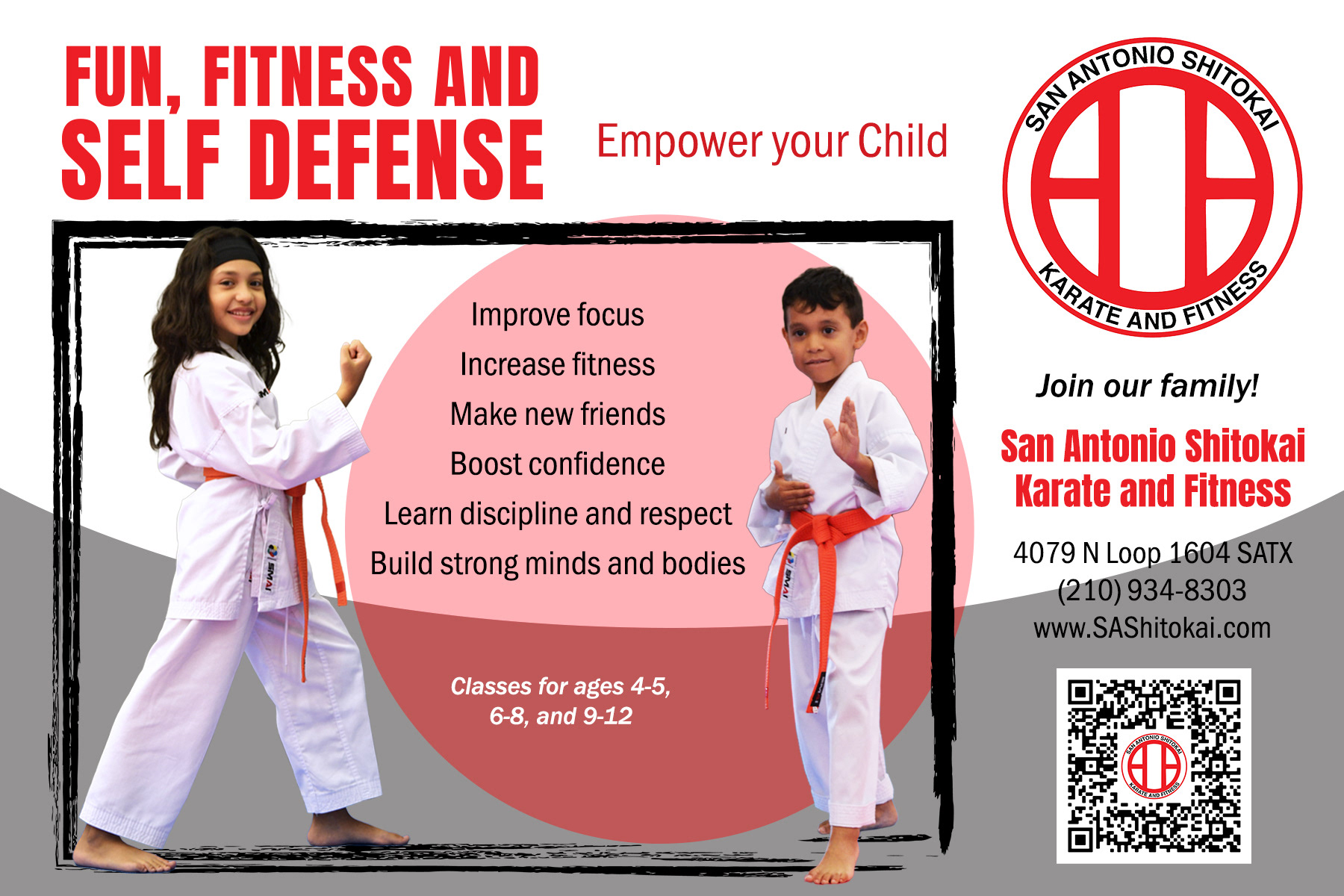
The client decided they wanted a landscape orientation for the ads, as well as a simplified rising sun circle. I moved the business name and address outside the frame, which created different compartments/columns, giving the ad a more open and grounded vibe. We decided to add the student’s brother to the ad to suggest that multiple ages and genders were welcome. The client changed the subtitle to “Empower your Child”, which was more of a call to action. So inviting!
Case Study #2: Nonprofit Reading Event
Original

Quiet Realism
Playful
Original Quiet Realism Playful
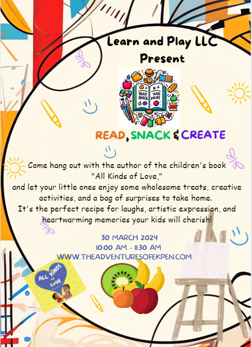
This children's book author wanted an engaging invitation to her community event focusing on literacy, healthy eating, and creativity. She had mocked up her own ad, shown on the left. The original was busy and included a variety of images of different styles. Despite the colorful icons, the background was beige. Although she knew a bit about text hierarchy and treatments to define the various sections, the Comic Sans font made the look a bit crafty.
I presented her with three options. Two are shown above. The middle "quiet realism" example is very uncluttered and calm. The more realistic imagery was meant to appeal to the parents, while the bright colors still signified that the event was for children. It uses literal illustrations to symbolize the tri-part event: a book, an apple, and a box of crayons.
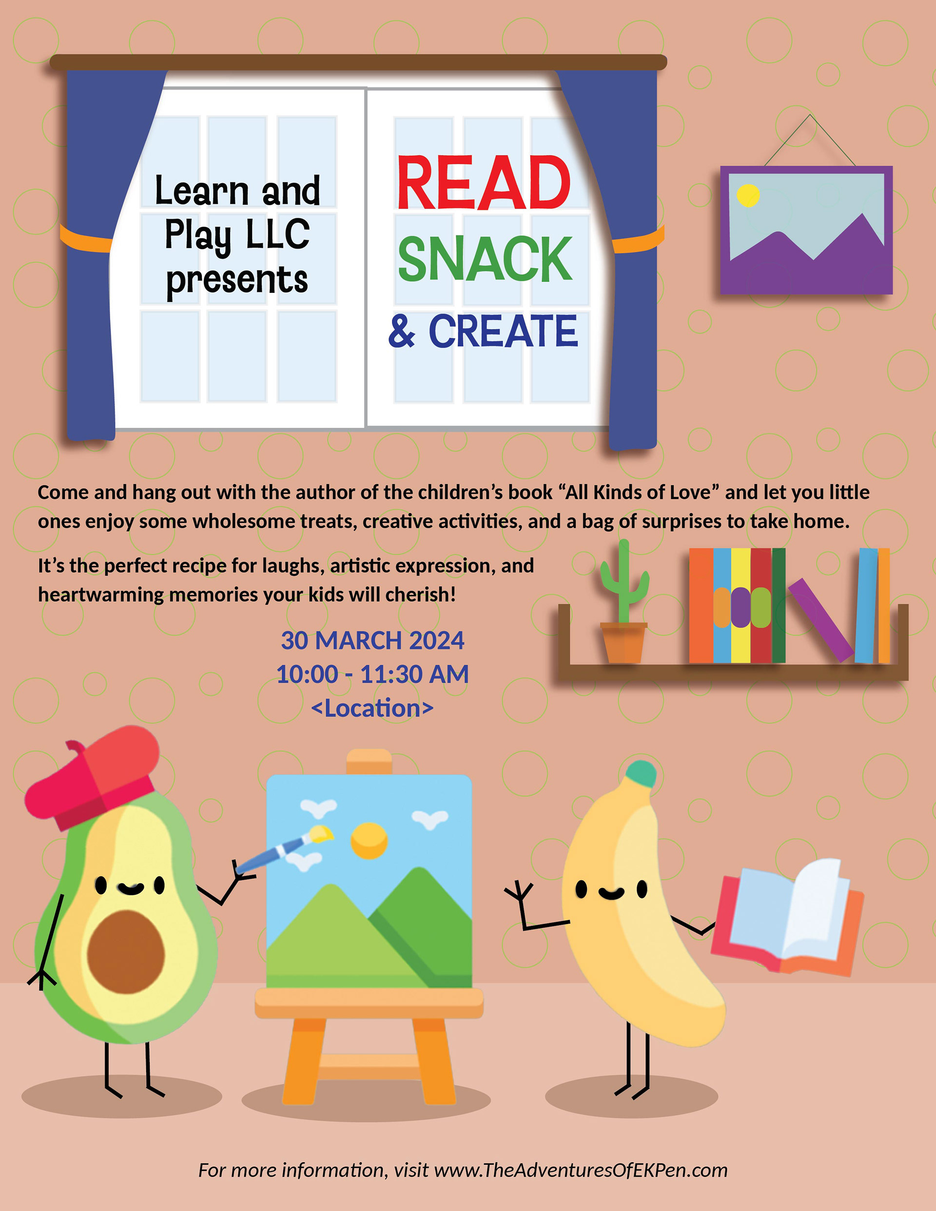
The "playful" prototype on the right infuses my love of whimsy. The "snacks" are reading and making art! The room includes a bookshelf and painting to further identify the reading and art themes, while the title is neatly framed in the room's window. The background wallpaper includes a fun pattern of avocado green circles, which is unobtrusive to the text, but gives an added sense of fun. The author ultimately chose a combination of this version with the title treatment from my third prototype.